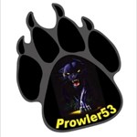
Prowler53 Posted July 14, 2006 Share Posted July 14, 2006 I've been working on a personal geocoin graphic and I just wanted your input on what I have so far. I'm thinking black nickel and instead of a round coin, maybe have the coin shaped around the paw print. Glowing eyes was another thought. any Input? Link to comment
Prowler53 Posted July 14, 2006 Author Share Posted July 14, 2006 Wow, beautiful coin. Thank you I just sent it off to coins & pins and also oakcoins for a price quote. Link to comment
danoshimano Posted July 14, 2006 Share Posted July 14, 2006 Nice. My only constructive criticism would be to try to move all the text into the main paw area, rather than on the toes. That's how I see it from the pics. Either way, I look forward to it. Link to comment
+LadeBear68 Posted July 14, 2006 Share Posted July 14, 2006 I would have to disagree, the main part of the coin is very nice with the picture of the panther. Putting the words over the panther would take away from the gorgous picture. Link to comment
Prowler53 Posted July 14, 2006 Author Share Posted July 14, 2006 Nice. My only constructive criticism would be to try to move all the text into the main paw area, rather than on the toes. That's how I see it from the pics. Either way, I look forward to it. Good Idea danoshimano ! I thought about that myself but I thought it would make the main part of the paw a little too busy. I'll have to do one up that way and see how it looks. Link to comment
Prowler53 Posted July 14, 2006 Author Share Posted July 14, 2006 I would have to disagree, the main part of the coin is very nice with the picture of the panther. Putting the words over the panther would take away from the gorgous picture. LOL......I guess I have to put it up for a vote. Link to comment
+SeabeckTribe Posted July 14, 2006 Share Posted July 14, 2006 Thank you I just sent it off to coins & pins and also oakcoins for a price quote. Have you thought about sending it off to Rusty at personalgeocoins.com. He did an awsome job with our two! Link to comment
Prowler53 Posted July 14, 2006 Author Share Posted July 14, 2006 Thank you I just sent it off to coins & pins and also oakcoins for a price quote. Have you thought about sending it off to Rusty at personalgeocoins.com. He did an awsome job with our two! Thanks for the info. I never heard of Personalgeocoins.com. I'll check them out! What size coin do you think I should go with? Link to comment
+Cornerstone4 Posted July 15, 2006 Share Posted July 15, 2006 Whatever size you decide on, make sure you print it out as and actual size print and look at it. One thing I learned the hard way, is that text that looks great on your computer screen, can be extremely small, and sometimes illegible once you have the coin in-hand. Link to comment
+The Blind Acorn Posted July 15, 2006 Share Posted July 15, 2006 WOW What a coin... I definitely would like one, but I echo what the others are saying about text size.. Link to comment
+chrisgun Posted July 15, 2006 Share Posted July 15, 2006 I only collect round coins, but I may have to make an exception in this case. That's quite a cool coin. Can't wait to see it in my hand Link to comment
+8 Muddy Feet Posted July 15, 2006 Share Posted July 15, 2006 Having a nontypical shaped coin is a plus. this design looks great and the idea of a blacklight glow in the dark feature sure would be cool. Count us in for a trade if you are interested in an 8 Muddy Feet coin Link to comment
+Nero Posted July 15, 2006 Share Posted July 15, 2006 nice art. now is that supose to be a picture in the paw prints, or do you want that to be a 3d design? Link to comment
+4BOWS Posted July 15, 2006 Share Posted July 15, 2006 Great looking coin, but we would have to agree with some of the others that the type will become really small when actual size. Make sure you print it out at full size to really see how small the text will become. Link to comment
+Chooch72 Posted July 15, 2006 Share Posted July 15, 2006 This is a great coin!!! Very nice and would love to see it produced... Link to comment
Prowler53 Posted July 15, 2006 Author Share Posted July 15, 2006 Having a nontypical shaped coin is a plus. this design looks great and the idea of a blacklight glow in the dark feature sure would be cool. Count us in for a trade if you are interested in an 8 Muddy Feet coin I'm figuring on getting 100 coins for the first run to see how they go. I'll probably pre-sell 75-80 and keep the rest for trades and to send a few in caches. I'm thinking about getting the first set numbered. If I knew they would take off really well I would get more made but since this is my first try at this I wanted to see how it went first. Link to comment
Prowler53 Posted July 15, 2006 Author Share Posted July 15, 2006 nice art. now is that supose to be a picture in the paw prints, or do you want that to be a 3d design? I think it would look best in a picture but I'll see what the coin company comes up with for ideas. I would like to keep the coin looking as close to the graphic as possible. Link to comment
+Chaos A.D./aka Arlsdaddy Posted July 15, 2006 Share Posted July 15, 2006 Black nickel is cool, but doesn't look very good on many coins. This one may be an exception though. I'll be very interested to see how the die art looks, and of course the final coin. Very beautiful, but the final product could be very different. Link to comment
+Nero Posted July 15, 2006 Share Posted July 15, 2006 nice art. now is that supose to be a picture in the paw prints, or do you want that to be a 3d design? I think it would look best in a picture but I'll see what the coin company comes up with for ideas. I would like to keep the coin looking as close to the graphic as possible. I think pics would be best as well., very cool. im also very interested in seeing proofs. Link to comment
+The Amigos Posted July 15, 2006 Share Posted July 15, 2006 Absolutely AWESOME! If it comes out to look like the pic, it should go very well. It is beautiful, if my opinion counts. AND....I would buy several, so put my name on the list!! Non-typical is awesome. I think when we do ours, it will be non-typical. Link to comment
Prowler53 Posted July 15, 2006 Author Share Posted July 15, 2006 nice art. now is that supose to be a picture in the paw prints, or do you want that to be a 3d design? I think it would look best in a picture but I'll see what the coin company comes up with for ideas. I would like to keep the coin looking as close to the graphic as possible. I think pics would be best as well., very cool. im also very interested in seeing proofs. I'll be posting the proofs as soon as I get them. I just sent requests out for prices today and I'm not sure how long it takes to get the quotes. The graphics have been sent to coins & pins, Oakcoins and Personalgeocoins.com Link to comment
+islander1988 Posted July 15, 2006 Share Posted July 15, 2006 I'm figuring on getting 100 coins for the first run to see how they go. I'll probably pre-sell 75-80 and keep the rest for trades and to send a few in caches. I'm thinking about getting the first set numbered. If I knew they would take off really well I would get more made but since this is my first try at this I wanted to see how it went first. If you're considering doing another run if they go well, be sure to say that up front when you're selling them. Some people take the minted numbers into account when they purchase and don't like it if more get minted later (since it reduces the demand for trades, etc.). Some people just do second mintings in a different metal to preserve the original numbers, but since black nickel is a rather unique metal colour that might not be an easy option for this coin. Link to comment
Prowler53 Posted July 15, 2006 Author Share Posted July 15, 2006 I'm figuring on getting 100 coins for the first run to see how they go. I'll probably pre-sell 75-80 and keep the rest for trades and to send a few in caches. I'm thinking about getting the first set numbered. If I knew they would take off really well I would get more made but since this is my first try at this I wanted to see how it went first. If you're considering doing another run if they go well, be sure to say that up front when you're selling them. Some people take the minted numbers into account when they purchase and don't like it if more get minted later (since it reduces the demand for trades, etc.). Some people just do second mintings in a different metal to preserve the original numbers, but since black nickel is a rather unique metal colour that might not be an easy option for this coin. Good Thinking......I think I'll keep it at 100 total coins. Link to comment
+whitebear Posted July 15, 2006 Share Posted July 15, 2006 I love it! ...but I have a thing for pawprints. I would like to see the shape done around the paw with the claws protruding out from the edge,would look real good in my opinion .Also some of the wording could be put between the main pad & the outer ones ,this would enable the use of larger letters. I would also be in for 3 or 4 if the price is right . Link to comment
+Ryder3 & Better Half Posted July 15, 2006 Share Posted July 15, 2006 I would have to disagree, the main part of the coin is very nice with the picture of the panther. Putting the words over the panther would take away from the gorgous picture. We agree with LadeBear68. Putting the words over the panther would take away from the impact of this truely awesome panther. Glowing eyes and having it shaped like a paw print would put it over the top! AWESOME job on this one! We are DEFINATELY looking forward to seeing this one! Thanks for sharing! Link to comment
glennk721 Posted July 15, 2006 Share Posted July 15, 2006 (edited) This is a really cool design, love the paw print and panther glowing just a plus !! , outstanding, agree with the others to shift the type across the other "pads" so it can be larger , I also love unusual shape coins think you have a really nice design, hope the proofs have alot of 3D relief, Whitebears idea of extending claws it also great, Just don't make them to sharp , Put me on the list for a few, Would like to see a Silver version also !! Glenn Edited July 15, 2006 by glennk721 Link to comment
+~tasia~ Posted July 15, 2006 Share Posted July 15, 2006 I love the design. I'd definitely want a few : ) Link to comment
+xfalcon1 Posted July 15, 2006 Share Posted July 15, 2006 Will it have an Icon or just the stinkin personal coin icon, im sure you could do a really cool icon Link to comment
+SkinGuy Posted July 15, 2006 Share Posted July 15, 2006 Great design! I'd also share the concerns posted earlier about the crispness of the artwork and legibility of the print at "real" size. Looking forward to seeing how this one turns out! Link to comment
+Damenace Posted July 15, 2006 Share Posted July 15, 2006 (edited) <cough><clear throat> Alright, you have done it now !!! As a huge fan of black panthers (the cat) which would include many pictures all over my walls and a tattoo I would say that I must have one of these . I know it is early and you have only asked for input of the design, I would like to ask if you would consider a trade for my personal . If not I would understand, but then you have really done me in . I have not purchased a coin in some time, this coin would cause me to turn over the new leave in the coin purchasing world . Regardless of the results put me down for one . </clear throat></cough> Edited July 15, 2006 by Damenace Link to comment
Prowler53 Posted July 15, 2006 Author Share Posted July 15, 2006 Great looking coin, but we would have to agree with some of the others that the type will become really small when actual size. Make sure you print it out at full size to really see how small the text will become. Ok.......after hearing suggestions that the text size may not be big enough on the actuall coin, I began doing some work on it. This is another option that I came up with. I still like the first graphic better myself but if the text is going to be too small I guess I'll have to go with my second option. Making the text larger and putting it on the main part of the paw print just didn't look right so I came up with an Idea to change the text color so It would stand out better on the white background, and then put part of the text on the paw print and part of it just below the paw print. How do you think this would look on a coin? Link to comment
+Ryder3 & Better Half Posted July 15, 2006 Share Posted July 15, 2006 looks AWESOME!!! Link to comment
+The Blind Acorn Posted July 15, 2006 Share Posted July 15, 2006 Nice change. You're doing a great job with your design! Link to comment
+Team JSAM Posted July 15, 2006 Share Posted July 15, 2006 I like the second desingn better (not that the first was bad either) I still think trying to put everything on the main paw is the best idea. -TJ Link to comment
Prowler53 Posted July 15, 2006 Author Share Posted July 15, 2006 I like the second desingn better (not that the first was bad either) I still think trying to put everything on the main paw is the best idea. -TJ Thanks.....Everyones opinion helps! I did try putting the text on the main part of the paw as you can see from the front graphic. The rear of the coin was the hard part. I tried to squeeze it on without taking away from the picture but no matter how I did it...It just didn't look right. I still have another Idea I'm going to work on later but so far I think the 2nd graphic will work out best as far as the text size. Link to comment
+Team JSAM Posted July 15, 2006 Share Posted July 15, 2006 what size were you going to make the coin 1.5, .175, 2? Link to comment
Prowler53 Posted July 15, 2006 Author Share Posted July 15, 2006 what size were you going to make the coin 1.5, .175, 2? Was thinking 1.75 or 2" I guess it's going to depend on the price. Link to comment
+ozymandiasism Posted July 15, 2006 Share Posted July 15, 2006 What exactly is the shape of the coin? I know it is paw-shaped, but where exactly is the edge of the coin? Link to comment
Prowler53 Posted July 15, 2006 Author Share Posted July 15, 2006 What exactly is the shape of the coin? I know it is paw-shaped, but where exactly is the edge of the coin? The edge will most likely be just outside of the paw print all the way around so it will have a white edge . I think I will have the claws notched out slightly rather than have the coin edge rounded off on the top. I'm getting some good Ideas from everyone here Right now I'm working on getting the text inside the main part of the paw without covering any of the panther graphic. I'm just about finished and I'll post the pics to see what everyone thinks. Then It's decision time on what will look best on the coin. Link to comment
Flying Spaghetti Monster Posted July 16, 2006 Share Posted July 16, 2006 Locking this thread as it's now a duplicate. Link to comment

Recommended Posts