+farrtom Posted April 22, 2011 Share Posted April 22, 2011 How important is a custom coin icon to you when it comes to purchasing or trading for a coin? Quote Link to comment
+plumbrokeacres Posted April 22, 2011 Share Posted April 22, 2011 I activate at least one coin in a series for the icon, it feel almost a rippoff when there isn't a custom icon, However, I don't buy or trade coins based on the icon but on the coin. but the icon will tip me over to buying if I'm on the fence. Quote Link to comment
+Droo Posted April 22, 2011 Share Posted April 22, 2011 Very important. If a vendour charges as much for a coin without the custom icon as others do for a coin with a custom icon I won't buy it. As for trading.... well, I would feel gipped if I went to activate the coin only to find it's got the generic icon - it totally defeated the purpose of activating it, to show the icon on my profile. My feeling is that if it's going to be trackable you might as well have the custom thumbnail representing the coin when it's being tracked. Quote Link to comment
GregsonVaux Posted April 22, 2011 Share Posted April 22, 2011 My observation has been that the custom icons are very important. The Europeans seem to be even more into them than people in the US. Personally, I don't let the icon determine whether I will buy a coin or not, but when I activate the coin and I see a generic icon, the coin seems cheaper to me. My advice to anyone making a coin is to splurge for the icon. Quote Link to comment
+the4dirtydogs Posted April 22, 2011 Share Posted April 22, 2011 I love the surprise of seeing what the icon is when I activate a coin. It's SOOOOO disappointing when that generic coin icon shows up. I also can't stand that all of those trackables get lumped into one pile in our trackable list that is viewed by others. But that's just me!! Quote Link to comment
+EyeD10T Posted April 22, 2011 Share Posted April 22, 2011 (edited) If I am not sure about a coin, lack of a custom icon is a deal breaker...I have a couple of coins that have generic icons and I dont get the "Total Package" feel from them. Edited April 22, 2011 by EyeD10T Quote Link to comment
avroair Posted April 22, 2011 Share Posted April 22, 2011 Very important. If a vendour charges as much for a coin without the custom icon as others do for a coin with a custom icon I won't buy it. As for trading.... well, I would feel gipped if I went to activate the coin only to find it's got the generic icon - it totally defeated the purpose of activating it, to show the icon on my profile. My feeling is that if it's going to be trackable you might as well have the custom thumbnail representing the coin when it's being tracked. I concur with all of this. I hate it when a vendor sells a coin without an icon or puts stipulations on 'so many must be sold to get a custom icon.' It's like icon robbery! Quote Link to comment
+MoonCatKDT & Peanut Posted April 22, 2011 Share Posted April 22, 2011 When I activate a coin that ends up not having a custom icon, I get that cheap feeling, especially if I paid good money for said coin. To me the icon kind of finishes it off, and without it the coin has a cheap feeling. Quote Link to comment
+Six Little Spookies Posted April 22, 2011 Share Posted April 22, 2011 Icons, icons, icons!! They are not a must have, but it is a bummer when they done have one. Really disappointing is when the coin is super cool. The coin is great, but in your icon list your coin just looks...generic. Why would anyone browsing a list stop to look at your coin? It's never too late to add an icon! (Czech, Stone, Glass, and Wood, those are awesome coins but who would know it from looking at my icon list!) But another question arises: Why does Groundspeak charge $150 for an icon? How much work can it be? Upload 2 .gifs and they're done! C'mon Signal, you've been doing this for years, it's got to have become a more streamlined, cost efficient process by now! Quote Link to comment
GregsonVaux Posted April 23, 2011 Share Posted April 23, 2011 But another question arises: Why does Groundspeak charge $150 for an icon? How much work can it be? Upload 2 .gifs and they're done! C'mon Signal, you've been doing this for years, it's got to have become a more streamlined, cost efficient process by now! As a coin designer, I don't like paying for the icon and the tracking numbers, but I understand it and really support it. Those fees are how Groundspeak pays to keep its servers running and all of the maintenance and overhead. Running an organization like that takes lots of money. Quote Link to comment
+AtlantaGal Posted April 23, 2011 Share Posted April 23, 2011 I'm old school and personally don't care. However most people do care and because of that, then I think they are needed. Quote Link to comment
+CCWelch Posted April 23, 2011 Share Posted April 23, 2011 I have to say that I am a little disappointed when a really good design has a generic icon. However, I have also learned that just because it has a generic icon when it first comes out does not mean that it always will.An icon can be added at a later date and it is retroactive to coins already sold and activated. Quote Link to comment
+tsunrisebey Posted April 23, 2011 Share Posted April 23, 2011 If you're going to sell a coin to the general coiner public, you best have an icon. Heck even if you are looking to trade them it's probably a good idea too. Coiners have addiction problems They like their shiny bling and iconery. My personal opinion: I could care less if the coin is trackable or has an icon. I think icons are a big waste of money BUT I know I'm definitely in the minority in my thinking on that one. tsun Quote Link to comment
+Team kizb Posted April 23, 2011 Share Posted April 23, 2011 Yup, a custom Icon is a must if your going to be selling the coin. If its a personnel coin you could choose not to have one, but I feel the custom icon adds to the uniqueness of any coin. Quote Link to comment
+farrtom Posted April 26, 2011 Author Share Posted April 26, 2011 It looks like custom icon it is. For those who have made them any advice? I was looking for more information or tips on creating them but I have not found much in the way of help. Quote Link to comment
GregsonVaux Posted April 26, 2011 Share Posted April 26, 2011 It looks like custom icon it is. For those who have made them any advice? I was looking for more information or tips on creating them but I have not found much in the way of help. I have not made a lot of icons, but here is my limited advice and knowledge. The icons will be 32x32 pixels and 16x16 pixels so keep the design on the simpler side. By the way, the icon that is displayed by Groundspeak is determined by the particular page opened, so at some parts of the website the large icon will appear and at other parts of the website, the small icon will appear. To make the icon, open your favorite graphics software and go to the menu where you can set either the "page size" or "canvas size". You will be able to set the size in various units such as "inches", "centimeters", or "pixels", choose pixels. For the large icon, choose 32x32 and for the small icon choose 16x16. You will then create your design keeping in mind that it will be very small. To see what it will actually look like, set the zoom to 100%. You should then see what the icons will look like when opened in Groundspeak's website. It may be simpler to first set the canvas or page size to 500x500 pixels. When the design is complete, then “resize the image” to 32x32 pixels. My personal opinion is that simple and bold is the way to go for icons. Is this the kind of information you were looking for? Quote Link to comment
+farrtom Posted April 26, 2011 Author Share Posted April 26, 2011 It looks like custom icon it is. For those who have made them any advice? I was looking for more information or tips on creating them but I have not found much in the way of help. I have not made a lot of icons, but here is my limited advice and knowledge. The icons will be 32x32 pixels and 16x16 pixels so keep the design on the simpler side. By the way, the icon that is displayed by Groundspeak is determined by the particular page opened, so at some parts of the website the large icon will appear and at other parts of the website, the small icon will appear. To make the icon, open your favorite graphics software and go to the menu where you can set either the "page size" or "canvas size". You will be able to set the size in various units such as "inches", "centimeters", or "pixels", choose pixels. For the large icon, choose 32x32 and for the small icon choose 16x16. You will then create your design keeping in mind that it will be very small. To see what it will actually look like, set the zoom to 100%. You should then see what the icons will look like when opened in Groundspeak's website. It may be simpler to first set the canvas or page size to 500x500 pixels. When the design is complete, then “resize the image” to 32x32 pixels. My personal opinion is that simple and bold is the way to go for icons. Is this the kind of information you were looking for? This helps alittle. I am fairly handy with photoshop, but the main question is I can turn a photo into a GIF in the size required, but all the icons are "cartoony" and not photo quality. Do I have to make it cartoon like or does someone convert the photo for you. Quote Link to comment
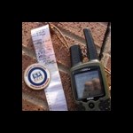
GregsonVaux Posted April 26, 2011 Share Posted April 26, 2011 Is this the kind of information you were looking for? This helps alittle. I am fairly handy with photoshop, but the main question is I can turn a photo into a GIF in the size required, but all the icons are "cartoony" and not photo quality. Do I have to make it cartoon like or does someone convert the photo for you. It can be difficult to make a photo look good at 32x32 pixels. I think you would first need to transform it into a pencil sketch, ink sketch, or oil paining. This is to simplify the lines and increase the contrast so that it will still make sense at the greatly reduced resolution. Actually, I did make an icon based on a photograph by converting it into an oil painting. It worked out very well. Here is what the icon looked like This icon was made for the Mr. Gray coin based on a photograph of what I thought was the coin. Here is what the photograph looked like Quote Link to comment
+farrtom Posted April 26, 2011 Author Share Posted April 26, 2011 Is this the kind of information you were looking for? This helps alittle. I am fairly handy with photoshop, but the main question is I can turn a photo into a GIF in the size required, but all the icons are "cartoony" and not photo quality. Do I have to make it cartoon like or does someone convert the photo for you. It can be difficult to make a photo look good at 32x32 pixels. I think you would first need to transform it into a pencil sketch, ink sketch, or oil paining. This is to simplify the lines and increase the contrast so that it will still make sense at the greatly reduced resolution. Actually, I did make an icon based on a photograph by converting it into an oil painting. It worked out very well. Here is what the icon looked like This icon was made for the Mr. Gray coin based on a photograph of what I thought was the coin. Here is what the photograph looked like Good idea on converting the photo. Will try it out. That is the kind of advice I was hoping for (though I should have thought of that myself, duh!). Quote Link to comment
avroair Posted May 25, 2011 Share Posted May 25, 2011 An icon can be added at a later date and it is retroactive to coins already sold and activated. That's a good point. I was considering doing that to a couple of my older coins that shared an icon at the time (back then you had to buy 500 tracking numbers at a time!) Quote Link to comment

Recommended Posts
Join the conversation
You can post now and register later. If you have an account, sign in now to post with your account.
Note: Your post will require moderator approval before it will be visible.