


Zop
-
Posts
606 -
Joined
-
Last visited
Posts posted by Zop
-
-
Working now from Server: WEB15; Build: Tucson.Main.release-20150414.Release_276
-
BUG in nearby caches of type -
Noticed this again this morning:
Noted Server: WEB21; Build: Tucson.Main.release-20150414.Release_276
No amount of refreshing made any difference.
Running Windows 7 x64 Pro w/IE 11, latest patches, cleared temp & cache.
-
-
- What do you like most about challenge caches?
- What do you not like about challenge caches?
- What would you like to see changed about challenge caches?
- If you could describe your favorite challenge cache type, what would it be?
- What types of challenge caches do you avoid?
* Please note: This thread will be open for 3 weeks, until May 12, 2015.
-
- What do you like most about challenge caches? Easy way to pad one's D/T stats.
- What do you not like about challenge caches? To qualify for most, you must change the way you geocache
- What would you like to see changed about challenge caches? Remove the ALR and allow anyone who signs the log to log online.
- If you could describe your favorite challenge cache type, what would it be? N/A
- What types of challenge caches do you avoid? Any that require you to give away favorites without merit and ones that require a streak of more than a few days. Additionally, I really do not like to have to email the owner with qualifications. This is one reason I have so few EC's and Virts.
-
-
Here are the major issues as I see it. I know you will get the tool working at some point but aesthetically, it's horrible.
For this argument, I have my monitor set to 1600 X 1200 DPI on a Dell 20" Diag LCD, Internet Explorer v11, showing only address bar and menu toolbar. Total height of that is 3/4"
1) The page header (Dark Green with Geocaching logo, title and logged in user info: 1"
2) Page toolbar (lighter green bar below header):5/16"
Total space dedicated to header and toolbar 1 & 5/16" Not a real problem - no change from previous site.
3) Search field element containing title, search field, Filter button and text field for # results and Map These Results: 3.5"
Search field contains little to no information yet is given nearly twice the real estate as the header and toolbar combined.
Can easily be reduced by 60% by eliminating wasted space and providing only the needed three rows.
4) Search results field, top row with column ids: 1/2"
Search results field top row can easily be reduced by 50%
5) Search results body. Displays only 5.5 records, using 5.5" of space.
6) Icons are 9/16" high if found, 1/2" if unfound. This is a grotesque waste of space considering previous icons were 1/8"
7) Rows are now ~1/2" high to make up for the over sized icons? with a wasted full height row between records.
This waste of space can easily be reduced by opting for a more reasonably sized icon, and reducing the separator row heights to no more than 1/8" or 3/16".
Why not resolve this all by just adding the new features to the old search tool for us computer users and give the new look to those with tablets and phones?
The technology is readily available for a dynamic website to detect the difference between browsers, devices and resolution/screen size.
Geez.. I needed more coffee. Not Columns, ROWS. My bad.
Bump this too as the Lacky's are completely ignoring the initial question.
-
While I appreciate some of the new features included with the new search tool, and would like to use them once all of the bugs are ironed out, I just cannot fathom why the page is set up the way it is visually.
I just did a basic search by typing in a GC code and was pleased that that is working today but why are the results laid out the way they are?
The search window with the map underlay along with the header on the page take up more than 1/2 of the screen using a relatively standard screen resolution.
In the space where one would normally see 9 records, we are now only able to view 3 unless we scroll. Why the drastic reduction in efficiency and waste of space?
Also, why are the icons so massive?
Resolution: 1280 X 1024

Wouldn't it make more sense to reduce the amount of wasted space taken up by the search field? Seems to me that that could easily be dropped down to a single column under the header so the search results could be maximized for better display.
Being a Premium member, I can't test this but I have been asked to also point out that the new Advanced search tool is now PMO? So non PMO's are not allowed to search beyond 30mi?
Bump - Let's keep this on topic please. There is another thread for complaining about the lack of functionality.
-
Be sure to read the Advanced Search FAQ. It answers a lot of the questions people are having.
The search you want to do is easy with the new system once you learn it. Here is a link for all of the caches in OK sorted by most recent first: https://www.geocaching.com/play/search?r=37&sort=PlaceDate&asc=False
Thanks for this but nowhere in the FAQ is there any mention of why the terrible formatting and excessive waste of space.
Why are we long time paying customers being treated like we don't matter?
I understand that the youth are glued to their pocket toys but why are we to suffer due to their fads? Please don't sacrifice what was a viable site for those of us who still use computers and GPSr's for the passing fad iphone crowd. Don't they use the app in the first place?
-
Here are the major issues as I see it. I know you will get the tool working at some point but aesthetically, it's horrible.
For this argument, I have my monitor set to 1600 X 1200 DPI on a Dell 20" Diag LCD, Internet Explorer v11, showing only address bar and menu toolbar. Total height of that is 3/4"
1) The page header (Dark Green with Geocaching logo, title and logged in user info: 1"
2) Page toolbar (lighter green bar below header):5/16"
Total space dedicated to header and toolbar 1 & 5/16" Not a real problem - no change from previous site.
3) Search field element containing title, search field, Filter button and text field for # results and Map These Results: 3.5"
Search field contains little to no information yet is given nearly twice the real estate as the header and toolbar combined.
Can easily be reduced by 60% by eliminating wasted space and providing only the needed three rows.
4) Search results field, top row with column ids: 1/2"
Search results field top row can easily be reduced by 50%
5) Search results body. Displays only 5.5 records, using 5.5" of space.
6) Icons are 9/16" high if found, 1/2" if unfound. This is a grotesque waste of space considering previous icons were 1/8"
7) Rows are now ~1/2" high to make up for the over sized icons? with a wasted full height row between records.
This waste of space can easily be reduced by opting for a more reasonably sized icon, and reducing the separator row heights to no more than 1/8" or 3/16".
Why not resolve this all by just adding the new features to the old search tool for us computer users and give the new look to those with tablets and phones?
The technology is readily available for a dynamic website to detect the difference between browsers, devices and resolution/screen size.
Geez.. I needed more coffee. Not Columns, ROWS. My bad.
-
While I appreciate some of the new features included with the new search tool, and would like to use them once all of the bugs are ironed out, I just cannot fathom why the page is set up the way it is visually.
I just did a basic search by typing in a GC code and was pleased that that is working today but why are the results laid out the way they are?
The search window with the map underlay along with the header on the page take up more than 1/2 of the screen using a relatively standard screen resolution.
In the space where one would normally see 9 records, we are now only able to view 3 unless we scroll. Why the drastic reduction in efficiency and waste of space?
Also, why are the icons so massive?
Resolution: 1280 X 1024
Wouldn't it make more sense to reduce the amount of wasted space taken up by the search field? Seems to me that that could easily be dropped down to a single column under the header so the search results could be maximized for better display.
Being a Premium member, I can't test this but I have been asked to also point out that the new Advanced search tool is now PMO? So non PMO's are not allowed to search beyond 30mi?
-
The API isn't working at all for me. Can't update GSAK, can't create a Certitude record..
-
1. What do you use the bio box for?
I primarily use it to display my stats from a GSAK macro.
2. Do you display banners from caches or events on your profile? How important is it to you that you are able to display these on your profile?
No and that would be of no importance for me.
3. What do you most enjoy looking at on others' profiles?
In order of preference:
1) Top 10 favorited hidden list
2) Top 10 favorited found list
3) Gallery
4) statistics
4. Below you will find all the functionality that the page currently offers.
-
Place the items in a stack ranked list of priority. Things that are most important to you should be at the top.
-
Let us know if there is anything missing from the list.
-
What information isn’t necessary on the page? What is taking up screen space that shouldn’t be? What do you not find useful?
Profile:
-
-
ADD to top of list:Type of GPS used (Make/model) GPS or Smart Phone.
- Avatar image Unnecessary distraction
- Find count <-- Rather important IMHO. If I see a new cache has been placed by someone with a low number of finds, I may not bother to look for it until the hide has been found a few times
- Trackables logged count
- Send message to e-mail
- 'Member since:'
- Status of account (Premium, Lackey, etc…)
~ Link to give gift membership Does not need to be on the main profile page.
- Location
- Last visit to website
- Send a friend request (only shows when viewing someone else’s profile, not your own)
- See forum posts
Geocaches:
- Finds by cache type breakdown
- Link to all geocache finds
- Hides by cache type breakdown
-
Ratio of favorites to finds on placed caches
- Link to all geocache hides
Trackables:
- List of Trackable types discovered or moved by kind
~ Icons link to search list filtered to those Trackables
- List of trackable types owned
~ Icons link to search list filtered to those Trackables
Souvenirs: Souvenirs are a waste of resources and are unnecessary fluff.
-
List of souvenirs earned
~ Icons link to specific souvenir page
-
Date souvenir was acquired
Gallery:
- Image gallery starting with most recent
- Multiple pages
- If image is attached to geocache log, GC code is listed
- Clicking image opens bigger view that links to log page/edit
Lists:
- List of all caches that user has awarded a favorite point
- List of all public bookmark lists
Statistics:
- Statistics that have been made public on geocaching.com/my/statistics.aspx
-
Place the items in a stack ranked list of priority. Things that are most important to you should be at the top.
-
Please add the ability for us to receive notifications in plain text.
The new HTML format is inefficient and a waste of resources. Please keep it simple and functional.
-
The last time Groundspeak announced something new & wonderful, I dove in with both feet, from the perspective of creator and seeker. Though there were many folks quite vocal in opposition to the new idea, I found many of them to be interesting, (kinda like geocaches, some suck and some are great), and I sought to create interesting ones for the community. Then Groundspeak not only ended the idea, they went so far as to erase any trace of it. All that work, gone in a mouse click. "Poof!"
I was one of the many opposed to those and am very pleased to see them gone but I will agree that they didn't have to make them disappear altogether, unless of course corp discovered something about them that was worse than we all previously had advised?
In any case, I'm one of the old timers I guess. I use my GPS (not a phone), seek the hide and sign the log. Anything else really isn't geocaching to me. Not sure I'll spend any time looking into these 'Labs' either.
-
I know that this will probably upset a few Wherigo fans but honestly;
Now that you can no longer purchase a GPSr that supports Wherigo, perhaps Groundspeak should kill them off like Garmin has.
-
.png) 1
1
-
-
In one of my caches another user has logged a find, and used to log to completely talk trash about my cache, as well as give away the hide. My first instinct is to just delete the log, but I am afraid of that action being judged against me, so I have done nothing yet. My second instinct is to send a message to the user, asking them to change their log completely or else I will delete the log and that they have 24 hours to comply (but again, I have not taken any action)
OMG!! I can't help but to laugh!!! Her current log is (IMHO) FAR worse than the original one!!!
-
In one of my caches another user has logged a find, and used to log to completely talk trash about my cache, as well as give away the hide. My first instinct is to just delete the log, but I am afraid of that action being judged against me, so I have done nothing yet. My second instinct is to send a message to the user, asking them to change their log completely or else I will delete the log and that they have 24 hours to comply (but again, I have not taken any action)
-
Noticing this here as well.
Trying to view unknown caches placed by a specific user shows 'username' instead of the actual user and the error stated above.
<!-- Server: WEB14; Build: Web.HotFix_20130821.1 -->
-
I feel the need to jump in here and say that I feel the souvenirs are awesome. I hope Groundspeak continues to do more things like this since it encourages people to be more active in caching and helps OUR hobby flourish! I know it has motivated me to cache more than I normally would and I have noticed more people visiting my cache over the past few days also. We HAVE to stay relevant in order to attract new and younger users/players.... and getting Souvenirs/Badges/Whatever are what is currently used in video games/apps to keep people actively playing.
Good for you! I wish I could give you mine. I think they are silly and wish I could get rid of them.
-
With all the issues with deleting logs and COs not telling why they are, I suggest there is a change so when a CO deletes a log a box opens up that requires the CO to put the reason why the log is being deleted so the other cacher doesn't get upset wondering why gets deleted when the CO doesn't send a message. It would be so much easier for both parties involved.
I like this idea. C-MNM and I both had our logs deleted recently merely because we mentioned that we had to be careful of the syringes and a homeless encampment at GZ. Personally, I would want to know that kind of stuff before I started my search for a cache.
As a CO of several caches unless a log gives away the solution to a puzzle or the hide, I'll always send a message to the logger and ask for a change before I delete a log. Unless it's a blank one anyway.
-
It may have been me too. I remember suggesting it a long time ago but they never did anything. Now when I get a deletion notice I have no idea for what cache and I have to research which one and why.
I believe this suggestion would really relieve a lot of stress when someone not only has to delete a log but for the cacher receiving it.
When you receive the log deletion notice, it includes a link to the deleted log. I just copy it and paste it back into a new log with the same date with a note to the CO as to why I am reposting it.
-
Sorry if this has been submitted before, I just couldn't find anything using the search tool.
Please merge if an existing bug report exists.
The description explains the issue. using the maps to select an area to visit, I'll zoom out to see the density of puzzles or other unknowns but when I do, the Wherigo icons turn into unknown icons and Earthcache icons turn into virtuals.
This happens regardless of which maps I use and with both IE9 and Firefox.
-
For what it's worth. No pictures. No avatars.
Hope you guys can fix this.
Grtz Siemp
You say that like it's a bad thing? ;-)
-
Same here, cache pages show <!-- Server: WEB07; Build: Web.HotFix_20121204.1 -->
Tried Firefox and IE latest versions on Win 7 x64.
-
Those attributes are used to indicate the conditions that may be needed to find a cache's location.
Does your event require swimming or wading or a boat/canoe/kayak to get to it?
The attributes that might be more appropriate to this type of event would be the "Facilities" ones.
If I remember correctly, attributes are added to the cache page via an edit. Are you saying that when you go to do an edit, those attributes are not available?
B.
Correct, the attributes are not available in edit nor were they available when she crated the event. It's as though the attributes are simply not available for event postings.
-
My partner and I are hosting an event http://coord.info/GC3PQKA which is to be a Beach BBQ, swimming and Kayaking/Canoeing event yet we cannot locate nor add the desired attributes for may require wading, may require swimming etc... Where did they go???
TIA!
Zop for C-MNM.
.png)
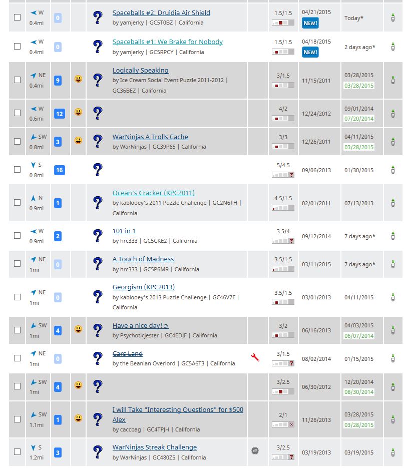
Now that the search results are so limited, is there a FF Plugin to make the results readable yet?
in How do I...?
Posted
Does anyone know if there is some sort of FireFox/Chrome Greasemonkey script or plug in which will allow us to view the search results in a more logical list manner?
In its current form, the search results page will only display 5 results without scrolling because of the massive banner and additional waste of space etc...
In the past, with the more efficient results page, we could easily see twice the number of results and not have to look at so much wasted space.
Thanks in advance for any links!
Z..