+sbell111 Posted October 9, 2009 Share Posted October 9, 2009 (edited) For some reason, the compass rose with cutout G reminds me of a tortoise (yes, I know, wrong number of appendages) - and that's not necessarily a bad thing Maybe it's a tortoise that didn't make it across the road. Edited October 9, 2009 by sbell111 Quote Link to comment
+Knight2000 Posted October 10, 2009 Share Posted October 10, 2009 Here's a version with a cutout G. I like that. Maybe if it was smaller though. I don't know why but I like the footsteps. They should go everywhere and trample the entire flag. It just seems to be missing something. No one else likes this instead of the confederate flag? Quote Link to comment
+ZeroHecksGiven Posted October 10, 2009 Share Posted October 10, 2009 I like that one more than the confederate flag, but I don't like either that much to begin with. Quote Link to comment
Rangerj Posted March 18, 2011 Share Posted March 18, 2011 I like this one best. Period. Question is, is it public domain? Quote Link to comment
Rangerj Posted March 18, 2011 Share Posted March 18, 2011 I like this kunarion's simple 'x marks the spot' best. Period. Question is, is it public domain? Quote Link to comment
knowschad Posted March 18, 2011 Share Posted March 18, 2011 I like this one best. Period. Question is, is it public domain? I prefer that one more. Quote Link to comment
+MikeAndHike Posted March 18, 2011 Share Posted March 18, 2011 My .02, I still like the original best. Way back at post #1. I will admit Kunarion's cut out G is getting better. I have to say that I am not a huge fan of that orange though. Regardless of where it came from it just doesn't appeal to me. The most recent cut out g is cool though. Wouldn't mind a high res version to download of just the logo if he is game for sharing. Final opinion, as a complete flag, the first is the best imho. Mike Quote Link to comment
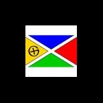
+kunarion Posted March 18, 2011 Share Posted March 18, 2011 I will admit Kunarion's cut out G is getting better. I have to say that I am not a huge fan of that orange though. Regardless of where it came from it just doesn't appeal to me. The most recent cut out g is cool though. Wouldn't mind a high res version to download of just the logo if he is game for sharing. Do you mean this "G" with the compass needles? I've "upgraded" computers since making that, which usually means a bunch of files evaporate, but I'll see what I've got. Quote Link to comment
+MikeAndHike Posted March 18, 2011 Share Posted March 18, 2011 Haha I hear ya with upgrading woes. I have just upgraded myself and keep looking for things that no longer are where they once were. But yes that is the logo I meant. If you are allowing others to use it I like it. I could probably whip one up but you've already done the grunt work so I thought I would ask. Quote Link to comment
+kunarion Posted March 19, 2011 Share Posted March 19, 2011 (edited) yes that is the logo I meant. Here are some logo files. At the moment, I can't get Inkscape to cooperate, to give me a "WMF" version, but if you need that, or have trouble with the other files, let me know. Anyone who wants to use this in a graphics project, feel free. This is a little GIF for reference (in a square avatar style): Two more (the EPS one should resize huge): http://kunarion.com/Geocache/CompassG.eps http://kunarion.com/Geocache/CompassG.png Edited March 19, 2011 by kunarion Quote Link to comment
+kunarion Posted March 19, 2011 Share Posted March 19, 2011 (edited) I like this one best. Period. Question is, is it public domain? Do you mean the one in Post #102 above? http://forums.Groundspeak.com/GC/index.php?showtopic=233087&view=findpost&p=4090138 Yes, you may use it in any way you see fit. It has a "Leatherman G", which I think has no particular restrictions. I was just playing around when I made it, so I didn't even use Illustrator. I've just now re-done it, to a larger scale. Try the following links. http://kunarion.com/Geocache/kunaflag1.jpg http://kunarion.com/Geocache/kunaflag1.png Edited March 19, 2011 by kunarion Quote Link to comment
+shadowmib Posted March 19, 2011 Share Posted March 19, 2011 Just a note about the american flag.. In heraldic terms, the red and white stripes are the main field of the flag, and the blue with stars is a canton (division) which is treated like a new device as far as tincture rules go. In a main field, you don't have color on color, or metal on metal. Where it touches the canton, it doesnt break the rules since it is considered an object above the field. My heraldry skills are a bit rusty, but I think you could describe the use flag thusly "Gules, 6 bars argent. In a canton azure, fifty 5-pointed stars argent" Notice.. metal Argent(silver/white) on color gules (red). Metal Argent on color azure (blue) One thing to notice. Pretty much ALL traffic signs and most advertising signs (that are visible at long distances) follow this same rule. Anyway back to the flag fun. Quote Link to comment

Recommended Posts
Join the conversation
You can post now and register later. If you have an account, sign in now to post with your account.
Note: Your post will require moderator approval before it will be visible.