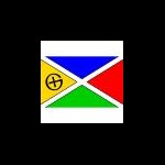
+DENelson83 Posted October 6, 2009 Share Posted October 6, 2009 (edited) The proportion of this flag is the golden ratio, said to be the most beautiful ratio in the world, and that symbolizes the beautiful things you can find on a cache hunt. Each colour used on the flag is used at least once on the flag of each country of the world, symbolizing the worldwide nature of this activity, and the arrangement of the colours reflects the same arrangement in the geocaching.com logo. The black saltire symbolizes the act of homing in on a specific location, sometimes from many directions, and finding something (think "X marks the spot"), and the logo in the gold portion of the flag is the public domain geocaching logo. The black border on the yellow portion is just to satisfy the heraldic requirement "never put colour on colour, nor metal on metal". Edited October 6, 2009 by DENelson83 Quote Link to comment
+Chrysalides Posted October 6, 2009 Share Posted October 6, 2009 The proportion of this flag is the golden ratio, said to be the most beautiful ratio in the world, and that symbolizes the beautiful things you can find on a cache hunt. Each colour used on the flag is used at least once on the flag of each country of the world, symbolizing the worldwide nature of this activity, and the arrangement of the colours reflects the same arrangement in the geocaching.com logo. The black saltire symbolizes the act of homing in on a specific location, sometimes from many directions, and finding something (think "X marks the spot"), and the logo in the gold portion of the flag is the public domain geocaching logo. The black border on the yellow portion is just to satisfy the heraldic requirement "never put colour on colour, nor metal on metal". Nice design, I like it. Are you putting this in the public domain? Or do you intend to sell related merchandise? No opinion either way, just curious. Quote Link to comment
+DENelson83 Posted October 6, 2009 Author Share Posted October 6, 2009 It's public domain, my friend. Feel free to have a flag in this design made for a geocaching event. Quote Link to comment
+Chrysalides Posted October 6, 2009 Share Posted October 6, 2009 It's public domain, my friend. Feel free to have a flag in this design made for a geocaching event. Thank you! I'm not planning any events in the foreseeable future, but it'll be a nice way to indicate which group are the lunatics in a crowded park Quote Link to comment
+DENelson83 Posted October 6, 2009 Author Share Posted October 6, 2009 It's public domain, my friend. Feel free to have a flag in this design made for a geocaching event. Thank you! I'm not planning any events in the foreseeable future, but it'll be a nice way to indicate which group are the lunatics in a crowded park Actually, I wasn't limiting that suggestion to you. Any geocacher can fly this flag to indicate that (s)he's a geocacher. It can be flown at any geocaching event, small or large. Quote Link to comment
+Chrysalides Posted October 6, 2009 Share Posted October 6, 2009 Actually, I wasn't limiting that suggestion to you. I know And I wasn't limiting my reply to you either The only event I attended, I didn't know anyone else, and had to wander around the park looking for a group of people with many of them holding GPSr. Having a flag where I could spot and home in would make me feel less intimidated approaching. Quote Link to comment
+DENelson83 Posted October 6, 2009 Author Share Posted October 6, 2009 Heck, if anyone is willing and able, they can put this flag image on a full-colour geocoin. Quote Link to comment
Clan Riffster Posted October 6, 2009 Share Posted October 6, 2009 Each colour used on the flag is used at least once on the flag of each country of the world There's no green, red, yellow or black in Finland's flag. Still, I love your design! Quote Link to comment
+NYPaddleCacher Posted October 6, 2009 Share Posted October 6, 2009 "never put colour on colour, nor metal on metal". You're preaching to the choir. Everyone knows your supposed to put hide-a-key containers or some other container with a magnet attached to it on metal. Quote Link to comment
+DeepButi Posted October 6, 2009 Share Posted October 6, 2009 (edited) Each colour used on the flag is used at least once on the flag of each country of the world There's no green, red, yellow or black in Finland's flag. Still, I love your design! Very few, if any, of world's flag have all (six) colours. Wrong sentence? Maybe "at least one of the colours used on the flag is used on the flag of each country of the wrold" ? Edited October 6, 2009 by DeepButi Quote Link to comment
+power69 Posted October 6, 2009 Share Posted October 6, 2009 The proportion of this flag is the golden ratio, said to be the most beautiful ratio in the world, and that symbolizes the beautiful things you can find on a cache hunt. Each colour used on the flag is used at least once on the flag of each country of the world, symbolizing the worldwide nature of this activity, and the arrangement of the colours reflects the same arrangement in the geocaching.com logo. The black saltire symbolizes the act of homing in on a specific location, sometimes from many directions, and finding something (think "X marks the spot"), and the logo in the gold portion of the flag is the public domain geocaching logo. The black border on the yellow portion is just to satisfy the heraldic requirement "never put colour on colour, nor metal on metal". Nice design, I like it. Are you putting this in the public domain? Or do you intend to sell related merchandise? No opinion either way, just curious. I think Groundspeak would have issue with someone selling something for profit with their logo on it. Quote Link to comment
Mr.Yuck Posted October 6, 2009 Share Posted October 6, 2009 The proportion of this flag is the golden ratio, said to be the most beautiful ratio in the world, and that symbolizes the beautiful things you can find on a cache hunt. Each colour used on the flag is used at least once on the flag of each country of the world, symbolizing the worldwide nature of this activity, and the arrangement of the colours reflects the same arrangement in the geocaching.com logo. The black saltire symbolizes the act of homing in on a specific location, sometimes from many directions, and finding something (think "X marks the spot"), and the logo in the gold portion of the flag is the public domain geocaching logo. The black border on the yellow portion is just to satisfy the heraldic requirement "never put colour on colour, nor metal on metal". Nice design, I like it. Are you putting this in the public domain? Or do you intend to sell related merchandise? No opinion either way, just curious. I think Groundspeak would have issue with someone selling something for profit with their logo on it. Nope, that's the good old public domain Geocaching logo. Hammered out in these same forums many years ago. They don't own the word Geocaching. Although some say they once tried. Quote Link to comment
+KoosKoos Posted October 6, 2009 Share Posted October 6, 2009 I think Groundspeak would have issue with someone selling something for profit with their logo on it. Probably why the public domain logo is used and not the Groundspeak geocaching logo. Quote Link to comment
+rob3k Posted October 6, 2009 Share Posted October 6, 2009 I think Groundspeak would have issue with someone selling something for profit with their logo on it. Probably why the public domain logo is used and not the Groundspeak geocaching logo. My assumption as well. Nice flag and I like the thought put into the details. Quote Link to comment
Mr.Yuck Posted October 6, 2009 Share Posted October 6, 2009 I think Groundspeak would have issue with someone selling something for profit with their logo on it. Probably why the public domain logo is used and not the Groundspeak geocaching logo. My assumption as well. Nice flag and I like the thought put into the details. I agree, works for me. Are you open to suggestions should some major consensus come along on any modifications? Quote Link to comment
+sbell111 Posted October 6, 2009 Share Posted October 6, 2009 The proportion of this flag is the golden ratio, said to be the most beautiful ratio in the world, and that symbolizes the beautiful things you can find on a cache hunt. Each colour used on the flag is used at least once on the flag of each country of the world, symbolizing the worldwide nature of this activity, and the arrangement of the colours reflects the same arrangement in the geocaching.com logo. The black saltire symbolizes the act of homing in on a specific location, sometimes from many directions, and finding something (think "X marks the spot"), and the logo in the gold portion of the flag is the public domain geocaching logo. The black border on the yellow portion is just to satisfy the heraldic requirement "never put colour on colour, nor metal on metal". Looks good. If I were to make any changes it would be to add a black border to the other colors as you have to the gold and to remove the black saltire. This would simplify the design while still giving the 'X marks the spot' impression that you were going for. Quote Link to comment
+Cedar Grove Seekers Posted October 6, 2009 Share Posted October 6, 2009 Looks good. If I were to make any changes it would be to add a black border to the other colors as you have to the gold and to remove the black saltire. This would simplify the design while still giving the 'X marks the spot' impression that you were going for. I agree. Looks good, but like sbell111's suggested modifications. Quote Link to comment
+Konnarock Kid & Marge Posted October 6, 2009 Share Posted October 6, 2009 The proportion of this flag is the golden ratio, said to be the most beautiful ratio in the world, and that symbolizes the beautiful things you can find on a cache hunt. Each colour used on the flag is used at least once on the flag of each country of the world, symbolizing the worldwide nature of this activity, and the arrangement of the colours reflects the same arrangement in the geocaching.com logo. The black saltire symbolizes the act of homing in on a specific location, sometimes from many directions, and finding something (think "X marks the spot"), and the logo in the gold portion of the flag is the public domain geocaching logo. The black border on the yellow portion is just to satisfy the heraldic requirement "never put colour on colour, nor metal on metal". Beautiful design. Could you upload it as a jpeg image? Thanks. Quote Link to comment
+DENelson83 Posted October 6, 2009 Author Share Posted October 6, 2009 (edited) If I were to make any changes it would be to add a black border to the other colors as you have to the gold and to remove the black saltire. This would simplify the design while still giving the 'X marks the spot' impression that you were going for. The black saltire can be removed, or even couped to put just an "X" in the centre, but adding a black border to the other colours would be a heraldic violation. The rule of tincture states, "metal should not be put on metal, nor colour on colour". White and yellow are considered "metals", while all other colours are called "colours". Touching black to blue, or white to yellow, violates this rule. But, since you sometimes have to put metal on metal to place a geocache (magnets), the border can be removed. Whaddaya think of this? Although I originally put the black saltire in to avoid the idea that geocaching was invented in Scotland. Edited October 6, 2009 by DENelson83 Quote Link to comment
+PorscheSpyder Posted October 6, 2009 Share Posted October 6, 2009 If I were to make any changes it would be to add a black border to the other colors as you have to the gold and to remove the black saltire. This would simplify the design while still giving the 'X marks the spot' impression that you were going for. The black saltire can be removed, or even couped to put just an "X" in the centre, but adding a black border to the other colours would be a heraldic violation. The rule of tincture states, "metal should not be put on metal, nor colour on colour". White and yellow are considered "metals", while all other colours are called "colours". Touching black to blue, or white to yellow, violates this rule. But, since you sometimes have to put metal on metal to place a geocache (magnets), the border can be removed. Whaddaya think of this? Although I originally put the black saltire in to avoid the idea that geocaching was invented in Scotland. I personally prefer the flag WITH the black lines. BTW, is there a place where I could print it off? Quote Link to comment
+Chrysalides Posted October 6, 2009 Share Posted October 6, 2009 There's no green, red, yellow or black in Finland's flag. There's white. Thought that counts? What does color on color / metal on metal mean when applied to flags and heraldry BTW? Quote Link to comment
Clan Riffster Posted October 6, 2009 Share Posted October 6, 2009 When it comes to flags, I prefer aesthetics to arbitrary, ancient rules. If a black border on a blue, (red/green/etc), triangle looks good, who really cares that it violates the 'metal on metal' rule? Quote Link to comment
+SUV2003 Posted October 6, 2009 Share Posted October 6, 2009 Love the design. Think you are onto something Quote Link to comment
+obsidianspider Posted October 6, 2009 Share Posted October 6, 2009 Although I originally put the black saltire in to avoid the idea that geocaching was invented in Scotland. That's funny you mention Scotland, when I saw the flag I immediately thought of South Africa's flag. Quote Link to comment
+sbell111 Posted October 6, 2009 Share Posted October 6, 2009 If I were to make any changes it would be to add a black border to the other colors as you have to the gold and to remove the black saltire. This would simplify the design while still giving the 'X marks the spot' impression that you were going for. The black saltire can be removed, or even couped to put just an "X" in the centre, but adding a black border to the other colours would be a heraldic violation. The rule of tincture states, "metal should not be put on metal, nor colour on colour". White and yellow are considered "metals", while all other colours are called "colours". Touching black to blue, or white to yellow, violates this rule. Quote Link to comment
+Castle Mischief Posted October 6, 2009 Share Posted October 6, 2009 Although I originally put the black saltire in to avoid the idea that geocaching was invented in Scotland. That's funny you mention Scotland, when I saw the flag I immediately thought of South Africa's flag. I thought, "if I was color-blind, I'd think this was Alabama's state flag." Quote Link to comment
+Castle Mischief Posted October 6, 2009 Share Posted October 6, 2009 If I were to make any changes it would be to add a black border to the other colors as you have to the gold and to remove the black saltire. This would simplify the design while still giving the 'X marks the spot' impression that you were going for. The black saltire can be removed, or even couped to put just an "X" in the centre, but adding a black border to the other colours would be a heraldic violation. The rule of tincture states, "metal should not be put on metal, nor colour on colour". White and yellow are considered "metals", while all other colours are called "colours". Touching black to blue, or white to yellow, violates this rule. You forgot the Geocache logo. Otherwise, nice effort but I doubt it will catch on. Quote Link to comment
+sbell111 Posted October 6, 2009 Share Posted October 6, 2009 (edited) If I were to make any changes it would be to add a black border to the other colors as you have to the gold and to remove the black saltire. This would simplify the design while still giving the 'X marks the spot' impression that you were going for. The black saltire can be removed, or even couped to put just an "X" in the centre, but adding a black border to the other colours would be a heraldic violation. The rule of tincture states, "metal should not be put on metal, nor colour on colour". White and yellow are considered "metals", while all other colours are called "colours". Touching black to blue, or white to yellow, violates this rule. You forgot the Geocache logo. Otherwise, nice effort but I doubt it will catch on. It appears to also violate the 'rule of tincture' since red and blue touch. I guess that we should replace it with something else. Edited October 6, 2009 by sbell111 Quote Link to comment
+Castle Mischief Posted October 6, 2009 Share Posted October 6, 2009 If I were to make any changes it would be to add a black border to the other colors as you have to the gold and to remove the black saltire. This would simplify the design while still giving the 'X marks the spot' impression that you were going for. The black saltire can be removed, or even couped to put just an "X" in the centre, but adding a black border to the other colours would be a heraldic violation. The rule of tincture states, "metal should not be put on metal, nor colour on colour". White and yellow are considered "metals", while all other colours are called "colours". Touching black to blue, or white to yellow, violates this rule. You forgot the Geocache logo. Otherwise, nice effort but I doubt it will catch on. It appears to also violate the 'rule of tincture' since red and blue touch. I guess that we should replace it with something else. I'm guessing that when it was designed, not much concern was given for such rules that were based in a part of the world that the designers were trying to sepparate themselves from. Now that one draft with the turkey on it; that one rocked. Quote Link to comment
+Chrysalides Posted October 6, 2009 Share Posted October 6, 2009 You forgot the Geocache logo. Otherwise, nice effort but I doubt it will catch on. It appears to also violate the 'rule of tincture' since red and blue touch. I guess that we should replace it with something else. The fact that it violates the rules must be why so many people like to burn it. Quote Link to comment
+steve p Posted October 6, 2009 Share Posted October 6, 2009 The black saltire can be removed, or even couped to put just an "X" in the centre, but adding a black border to the other colours would be a heraldic violation. The rule of tincture states, "metal should not be put on metal, nor colour on colour". White and yellow are considered "metals", while all other colours are called "colours". Touching black to blue, or white to yellow, violates this rule.I don't think a "rule" that some guy made up in 1568 should prevent you from doing something want to do in the flag design, or from changing a design so that it looks nicer. I do like the flag, but can't decide if I like the version with the large X or without. I think the size of the large X somewhat overwhelms the rest of the design. But the version without the X did look a bit sparse. Maybe a smaller X placed in the middle might be a good compromise. Great work! Quote Link to comment
+DENelson83 Posted October 6, 2009 Author Share Posted October 6, 2009 (edited) Maybe a smaller X placed in the middle might be a good compromise. Exactly what I was thinkin', Steve! Edited October 6, 2009 by DENelson83 Quote Link to comment
Tahosa and Sons Posted October 6, 2009 Share Posted October 6, 2009 Ok where is the compass rose for those of us that do it the other way. Quote Link to comment
+DENelson83 Posted October 6, 2009 Author Share Posted October 6, 2009 Ok where is the compass rose for those of us that do it the other way. You mean an orthogonal cross (+) instead of a saltire (X)? Quote Link to comment
+Chrysalides Posted October 6, 2009 Share Posted October 6, 2009 Ok where is the compass rose for those of us that do it the other way. I'm for keeping it simple. Otherwise we'd end up with the ammo box, film can, altoids tin and Lock-n-Lock on it. Maybe we should reserve that for the coat of arms. And we need to have the Tree of Angst on that... Quote Link to comment
Mr.Yuck Posted October 6, 2009 Share Posted October 6, 2009 Less white.... You know what? I think I agree with less white. Quote Link to comment
+DENelson83 Posted October 7, 2009 Author Share Posted October 7, 2009 You know what? I think I agree with less white.Less white it is. Quote Link to comment
+bittsen Posted October 7, 2009 Share Posted October 7, 2009 You know what? I think I agree with less white.Less white it is. Looks good. It just occurred to me that that would be the Groundspeak Geocaching flag as opposed to the standard geocaching flag. The colors are distinctively Groundspeak. Quote Link to comment
+DENelson83 Posted October 7, 2009 Author Share Posted October 7, 2009 (edited) You know what? I think I agree with less white.Less white it is. Looks good. It just occurred to me that that would be the Groundspeak Geocaching flag as opposed to the standard geocaching flag. The colors are distinctively Groundspeak. Well, the thing is, not just Groundspeak is using that colour arrangement. Lots of other geocaching organizations use it. http://www.geosnippits.com/ http://www.geocaching-qc.com/ http://yogosc.org/ http://www.mi-geocaching.org/ etc., etc. Edited October 7, 2009 by DENelson83 Quote Link to comment
+Stunod Posted October 7, 2009 Share Posted October 7, 2009 The colors are distinctively Groundspeak. Or Microsoft... Quote Link to comment
+jasondulac Posted October 7, 2009 Share Posted October 7, 2009 The proportion of this flag is the golden ratio, said to be the most beautiful ratio in the world, and that symbolizes the beautiful things you can find on a cache hunt. Each colour used on the flag is used at least once on the flag of each country of the world, symbolizing the worldwide nature of this activity, and the arrangement of the colours reflects the same arrangement in the geocaching.com logo. The black saltire symbolizes the act of homing in on a specific location, sometimes from many directions, and finding something (think "X marks the spot"), and the logo in the gold portion of the flag is the public domain geocaching logo. The black border on the yellow portion is just to satisfy the heraldic requirement "never put colour on colour, nor metal on metal". did you ever think about making this into a geocoin I think it would make a great coin just my opinion Quote Link to comment
+DENelson83 Posted October 7, 2009 Author Share Posted October 7, 2009 (edited) did you ever think about making this into a geocoin I think it would make a great coin just my opinion I don't have the funds. Maybe you can help? The flag image is public domain, after all. Edited October 7, 2009 by DENelson83 Quote Link to comment
+jasondulac Posted October 7, 2009 Share Posted October 7, 2009 did you ever think about making this into a geocoin I think it would make a great coin just my opinion I don't have the funds. Maybe you can help? The flag image is public domain, after all. you could try showing your flag to geocoin vendors some vendors if they like an Idea will make it at no cost to you and sell it on there site of course you will get a few coins for your Idea Quote Link to comment
Dinoprophet Posted October 7, 2009 Share Posted October 7, 2009 rrrrm....I don't like the small X. I'd still like to see it with black trim on all four colors and no other black lines. Quote Link to comment
+Knight2000 Posted October 7, 2009 Share Posted October 7, 2009 (edited) 'sup with the red? Still looks way off to me. It needs footsteps and an X. Actually I kind of dislike the whole thing. I like the simple leatherman with maybe some footsteps at the most. Edited October 7, 2009 by Knight2000 Quote Link to comment
+ZeroHecksGiven Posted October 7, 2009 Share Posted October 7, 2009 (edited) Not digging it at all, way too harsh on the eyes, just seems to clash to me. Take note of groundspeaks use of the colors. They compliment each other pretty well. I think someone could come up with something a little more original and classic in my opinion. Something like a military flag which has some nice slogan on it as well and something proud to display. I'd like feel like some old folks who have like ten neon windsocks hanging off their RV with that. No offense, just sayin' Edited October 7, 2009 by NWCREW Quote Link to comment
+DENelson83 Posted October 7, 2009 Author Share Posted October 7, 2009 (edited) Well, I've just realized that the colour arrangement in my flag is also the colour arrangement in the favicon you see when you go to Google. And since Google is the #1 search engine online, and Geocaching is the sport where you're the search engine, the colour scheme seems even more appropriate. Edited October 7, 2009 by DENelson83 Quote Link to comment
+doingitoldschool Posted October 7, 2009 Share Posted October 7, 2009 You know what? I think I agree with less white.Less white it is. My reaction to the very first picture you posted was "hey, cool". To this one, "eee-ew, no way" Just one voice amongst many. Quote Link to comment
+tozainamboku Posted October 7, 2009 Share Posted October 7, 2009 If I were to make any changes it would be to add a black border to the other colors as you have to the gold and to remove the black saltire. This would simplify the design while still giving the 'X marks the spot' impression that you were going for. The black saltire can be removed, or even couped to put just an "X" in the centre, but adding a black border to the other colours would be a heraldic violation. The rule of tincture states, "metal should not be put on metal, nor colour on colour". White and yellow are considered "metals", while all other colours are called "colours". Touching black to blue, or white to yellow, violates this rule. You forgot the Geocache logo. Otherwise, nice effort but I doubt it will catch on. It appears to also violate the 'rule of tincture' since red and blue touch. I guess that we should replace it with something else. One of the advantages of having a revolution - you can throw out the old country's rules. Quote Link to comment

Recommended Posts
Join the conversation
You can post now and register later. If you have an account, sign in now to post with your account.
Note: Your post will require moderator approval before it will be visible.