+T"n"T Posted January 15, 2009 Share Posted January 15, 2009 I finally got around to doing our new personals. These are not for sale and will be traders. As not to fill up this area emails can be sent to tank@tntgeocoins.com I would love some feedback on this one as I still have time to change or add. At this time they will most likely not be trackable they will however be numbered, I think I will do two metals, Tank's favorite,black nickel, and my favorite, antique copper. Looking at 1.75" coin. I would love to trade personals coins you helped design. I will be going through requests as they come in. I am hoping to get these the end of Feb. Quote Link to comment
+fox-and-the-hound Posted January 15, 2009 Share Posted January 15, 2009 I always loved this image, but I have a couple ideas... I'd use a small "n" like your actual profile name and curve it to fit all the way down at the bottom of the coin. I'd put "flip a coin" and "it always lands" as curved text all at the top. Doing this would open up a tremendous amount of space so you could make the whole image larger within the coin. If you can overlap some of the text without making it unreadable, I'd push that to the limit and possibly even add a ring of enamel to increase the contrast of text away from the background. Something like this?... Of course you'd have to play quite a bit with color for best contrast, but it would look cool to have side-to-side contrasting colors when it was spinning in the air. Quote Link to comment
+sweetlife Posted January 15, 2009 Share Posted January 15, 2009 I always loved this image, but I have a couple ideas... I'd use a small "n" like your actual profile name and curve it to fit all the way down at the bottom of the coin. I'd put "flip a coin" and "it always lands" as curved text all at the top. Doing this would open up a tremendous amount of space so you could make the whole image larger within the coin. If you can overlap some of the text without making it unreadable, I'd push that to the limit and possibly even add a ring of enamel to increase the contrast of text away from the background. Something like this?... Of course you'd have to play quite a bit with color for best contrast, but it would look cool to have side-to-side contrasting colors when it was spinning in the air. We love your idea Fox and the hound, you are right this would make their coin look so much more stunning looking. Quote Link to comment
+opalsns Posted January 15, 2009 Share Posted January 15, 2009 I always loved this image, but I have a couple ideas... I'd use a small "n" like your actual profile name and curve it to fit all the way down at the bottom of the coin. I'd put "flip a coin" and "it always lands" as curved text all at the top. Doing this would open up a tremendous amount of space so you could make the whole image larger within the coin. If you can overlap some of the text without making it unreadable, I'd push that to the limit and possibly even add a ring of enamel to increase the contrast of text away from the background. Something like this?... Of course you'd have to play quite a bit with color for best contrast, but it would look cool to have side-to-side contrasting colors when it was spinning in the air. Yes, I agree, I love when the image bursts out of the coin, Very Cool Opalsns Quote Link to comment
+ThirstyMick Posted January 15, 2009 Share Posted January 15, 2009 I always loved this image, but I have a couple ideas... I'd use a small "n" like your actual profile name and curve it to fit all the way down at the bottom of the coin. I'd put "flip a coin" and "it always lands" as curved text all at the top. Doing this would open up a tremendous amount of space so you could make the whole image larger within the coin. If you can overlap some of the text without making it unreadable, I'd push that to the limit and possibly even add a ring of enamel to increase the contrast of text away from the background. Something like this?... Of course you'd have to play quite a bit with color for best contrast, but it would look cool to have side-to-side contrasting colors when it was spinning in the air. Yes, I agree, I love when the image bursts out of the coin, Very Cool Opalsns I agree too, it looks awesome like this! I've always loved your logo, it's so pretty Quote Link to comment
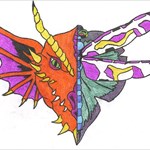
+geocachingdragon Posted January 15, 2009 Share Posted January 15, 2009 A very cool coin Quote Link to comment
+T"n"T Posted January 16, 2009 Author Share Posted January 16, 2009 Hummmm, Well since I was the idea personal and not the artist in the family. Could I talk you into helping get this looking as good as it seems to be coming along in your pic up there. I am sure that not only myself but the others looking to get this cool coin would enjoy it being even cooler. Quote Link to comment
+Rockin Roddy Posted January 16, 2009 Share Posted January 16, 2009 I love it and hope to find something to trade you with!!! Will send an email! Quote Link to comment
+fox-and-the-hound Posted January 17, 2009 Share Posted January 17, 2009 Hummmm, Well since I was the idea personal and not the artist in the family. Could I talk you into helping get this looking as good as it seems to be coming along in your pic up there. I am sure that not only myself but the others looking to get this cool coin would enjoy it being even cooler. Fixed the name and colors and sent you the updated files. Hope it helps Quote Link to comment
+Shop99er Posted January 17, 2009 Share Posted January 17, 2009 I would very much like to trade. My personal, "Court Order" can bee seen at geocoincollection.com. Quote Link to comment
+cache_in_hand Posted January 17, 2009 Share Posted January 17, 2009 E-mail sent. Super looking coin guys, I like the way it pops with the added color. Quote Link to comment

Recommended Posts
Join the conversation
You can post now and register later. If you have an account, sign in now to post with your account.
Note: Your post will require moderator approval before it will be visible.