+WYlostinMA Posted November 21, 2005 Share Posted November 21, 2005 (edited) Here is the deal, I have less than no skill at making icons, and we need two icons for gc.com for the coin tracking. So, we will give the person who comes up with the icon for the coin 1 Bronze and 1 Pewter Wyoming coin free. Here is what we need, we need the icon in two sizes. One 16 X 16 pixels and the second 32 X 32 pixels. Let the games begin... Here is an example of one that I tried to resize but it come out like crap. Also here is a picture of the coin... Edited November 21, 2005 by WYlostinMA Link to comment
+SPnZ Posted November 21, 2005 Share Posted November 21, 2005 "Less than no skill making icons".... Hmmm..... Try NOT making an icon... See if you wind up with a good one! But seriously. What do you want it to look like? What does the coin look like? I'd love to take a stab at it but would want some kind of direction to begin. Link to comment
+Mystery Ink Posted November 21, 2005 Share Posted November 21, 2005 (edited) "Less than no skill making icons".... Hmmm..... But seriously. What do you want it to look like? What does the coin look like? I'd love to take a stab at it but would want some kind of direction to begin. I would like to know the same. Edited November 21, 2005 by Mystery Ink Link to comment
+camel cacher Posted November 21, 2005 Share Posted November 21, 2005 what format do you need them in? and do you just want them posted or emailed? Link to comment
+Darby Gill Posted November 21, 2005 Share Posted November 21, 2005 (edited) here are some actual size. Edited November 21, 2005 by Darby Gill Link to comment
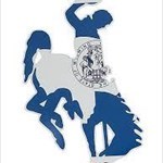
YemonYime Posted November 21, 2005 Share Posted November 21, 2005 I usually envision Wyoming colors as the University of Wyoming's brown and gold, but in doing a quick search, I found the Wyoming flag to be a field of blue with a red border. I just kind of quickly adapted that color scheme to a "circular" icon reflecting the shape of a coin, and with your bucking bronco. I can adjust it if you like the general idea. Email me through GC if you're interested. Yime Link to comment
+PassingWind Posted November 21, 2005 Share Posted November 21, 2005 I think you should go with the BUFFALO in the icon !! Link to comment
+biggeeks Posted November 21, 2005 Share Posted November 21, 2005 (edited) I like Yemon's, but here's what I came up with. or BGB Edited November 21, 2005 by biggeeks Link to comment
+AtlantaGal Posted November 21, 2005 Share Posted November 21, 2005 I like Yime's and Big Geek's. But Big Geeks shows up better and is more clear in the tiny size (set on left). Link to comment
SCP-173 Posted November 21, 2005 Share Posted November 21, 2005 Where is the tiny size used, anyway? I don't think I've ever seen it. I vote for the Yime design. Link to comment
YemonYime Posted November 21, 2005 Share Posted November 21, 2005 Here's a slight touch up, softening up the blue to make the bronco a bit more clear: Vars, the 16 pixel icons should be for your "My Account" page listing the last 30 days worth of logs. Although I have yet to see the smaller geocoin icons show up there. I've only ever seen the TB "pickup", "drop", and "swap" icons there when a geocoin gets moved. Link to comment
+pghlooking Posted November 21, 2005 Share Posted November 21, 2005 I vote for Yime's design as well. Link to comment
+biggeeks Posted November 21, 2005 Share Posted November 21, 2005 Here's my last self-promotion No this ISN'T my profile (I wish) - BGB Link to comment
+welch Posted November 21, 2005 Share Posted November 21, 2005 (edited) Here's a slight touch up, softening up the blue to make the bronco a bit more clear: That's cool, it even has similar coloring to the Wyoming flag Edited November 21, 2005 by welch Link to comment
+biggeeks Posted November 22, 2005 Share Posted November 22, 2005 I think you should go with the BUFFALO in the icon !! Another possibility...(totally different self-promotional ) Link to comment
+FlyinV Posted November 22, 2005 Share Posted November 22, 2005 We say, "Stick w/ the bronc!" Both Yime and BG have nice designs... glad we don't have to choose! Link to comment
+Team PEZ Posted November 22, 2005 Share Posted November 22, 2005 I've sent this to my friend Jamie, who has done all of our Georgia Coins, Ontario Coins, not to mention several other peoples personal coin. He will get back to you tomorrow. -TP Link to comment
+PassingWind Posted November 22, 2005 Share Posted November 22, 2005 Here's a slight touch up, softening up the blue to make the bronco a bit more clear: Vars, the 16 pixel icons should be for your "My Account" page listing the last 30 days worth of logs. Although I have yet to see the smaller geocoin icons show up there. I've only ever seen the TB "pickup", "drop", and "swap" icons there when a geocoin gets moved. Look to your "watchlist" for the small icons Link to comment
+Team Silver Posted November 22, 2005 Share Posted November 22, 2005 the bronco is great but so is the flag...go with the bronco... Link to comment
kcart Posted November 22, 2005 Share Posted November 22, 2005 I think it has be the bucking bronc (It's Wyoming!) ... but I really like the square icon idea/concept. ©¿©¬ Link to comment
+PassingWind Posted November 22, 2005 Share Posted November 22, 2005 (edited) We say, "Stick w/ the bronc!" Both Yime and BG have nice designs... glad we don't have to choose! Wyoming doesn't have a football team......Broncos play in Denver...come on! What's in Wyoming? Lots of Bison and Hot Air (YNP)! Edited November 22, 2005 by PassingWind Link to comment
+WYlostinMA Posted November 22, 2005 Author Share Posted November 22, 2005 Thank you to everyone who helped with the icon, the person who's design we have deceided to use, will be contacted.... Link to comment

Recommended Posts