


Gillala
-
Posts
71 -
Joined
-
Last visited
Everything posted by Gillala
-
Ho ho ho, It's way better, thanks. Still : - clicking on "More info" keeps opening the cache page in the same tab. It should by default open in a new one ! You manage to do it from the map's conceptual menu, it should be easy to do it here too ! Please ! - coming back from the cache page, most filters are now remembered, which is great. Still, some are not : ""basic/premium", "enabled/disabled", "has corrected coords Y/N". How about a filter "name doesn't contain" ? (If I want to ignore "bonus" or "challenge" caches, for exemple) And the previous location and zoom information are lost . Had the previous point (open in new tab) been done, this wouldn't happen... - when entering the search textbox, all previously text is deleted. That's not very user friendly - Why is there still no scale on the map ? I can guess distances in my home zone, but not in some remote area ! - Is the owner of a cache so unimportant that it's not even displayed in the preview of the cache in the left panel ? - Still no further map provider ? - Still no pocket queries integration ? Pity It's surely better, but there's still a lot to be done. I'm looking forward to seeing the result of the next iterations. Until then, I'll stick with the old quicker and more responsive map.
-
So, as others, I gave it a try, but I finally decided to opt out. The opt-out feedback form was too small, so I'll write more details here. Here my thoughts : - the new map is MUCH slower than the old one - The filters are a pain to use. They should apply automatically. The multiple checkboxes are not clear. What if I check "enabled" and "disabled" at the same time ? And it's still very limited. I'd like to show all my caches withOUT corrected coordinates (to know which mysteries I haven't solved yet). I want to filter by distance, by found date... - When I do a search, I want the result as a complete list (as it is now, with filterable columns over found/placed date, terrain, difficulty, distance...). I may want to map the result, sure. But not always ! Just add a link "map the results", but don't force a direct redirection to the map ! Moreover it's a waste of data. No problem with WiFi, which we don't always have... Please let the result of a search remain a list ! - The 500 caches limit is a little small in my dense cache area - I miss the PQ. I want to still be able to map the results of my PQs ! - the caches quick overview is still raw. For example, who's the owner (the people who actually create caches and without whom there'd be no game) ? ... - It's buggy (no more icons for my owned caches. More infos doesn't open the cache page in a new tab. Going back from a cache page, all previously applied filters are forgotten. The search box keeps forgetting what I previously wrote... The caches behind the filter panel are actually found ! The scale map disappeared !!! And different other bugs...) - The maps choice has drastically dropped. While I don't use it, I see other users complaining about that - And I might forget some other things Most of it has already been written in the thread of the forum. All in all, while the new map looks good, except the quick cache view with the latest logs, it's no real improvement over the old one, it's slow and buggy. And the whole scenario from the search page directly to the map is really not fluid. Please reconsider ! Sadly, the new map is now 2 months old and there seems to be no improvement. Users' feedback seems to be mostly ignored. Developers' feedback is mostly inexistent. The last 2-weeks sprint is now 1 month old. Does anyone even read this thread ? Does anyone still work on this project ? Do the developers actually use their map ? Do someone actually test them before they go live ? It unfortunately looks like ever since this agile development started, projects have been started, updated once or twice, then been put back to the backlog to start a new story. And everything finally stays in beta-status and nothing gets finished. What a pity
-
Hi, Have you planned on fixing this ongoing issue ? The widget has now been broken for months !
-
Hi all, The new map already looks great, well done ! I would just appreciate if the links from the left panel ("Log a cache", "More infos" ...) would open a new tab instead of opening in the current one. It's a pain to go back to the map and wait for the page to load afterwards. Also, as said by Tungstène, I'd rather see "only UNcorrected coordinates" in order to know for which myseries / multis... I don't have the final coords yet. The current filter doesn't really make sense for me. Maybe a filter "Only show caches with a TB" would be interesting. Otherwise, I really like the new map
-
Cannot click on caches on map; can only move map when clicking
Gillala replied to ecstaticbroccoli's topic in Website
Nope, still down, even after killing wy browser. -
Cannot click on caches on map; can only move map when clicking
Gillala replied to ecstaticbroccoli's topic in Website
Same for me. Zooming in and out didn't do the trick. Nor refreshing, nor closing the tab. EDIT : using chrome + win10 FWIW : common.js:22 Uncaught Error: fromContainerPixelToLatLng: Point.x and Point.y must be of type number at $k (common.js:22) at _.Yk._.m.fromContainerPixelToLatLng (common.js:184) at Object.<anonymous> (ScriptResource.axd?d=xxx:8455) at Object.<anonymous> (ScriptResource.axd?d=xxx:8341) at Object.fire (ScriptResource.axd?d=xxx:8348) at ScriptResource.axd?d=xxx:8409 at ScriptResource.axd?d=xxx:8403 at Object.get (ScriptResource.axd?d=xxx:8418) at Object.manager.getGrid (ScriptResource.axd?d=xxx:8402) at click (ScriptResource.axd?d=xxx:8409) -
Great, thanks for the quick fix
-
Hmmm, 20km*1.6=32km < 50km ! There has to be some other miscalculation...
-
Oups, this release note was published while I was writing this : Bug report
-
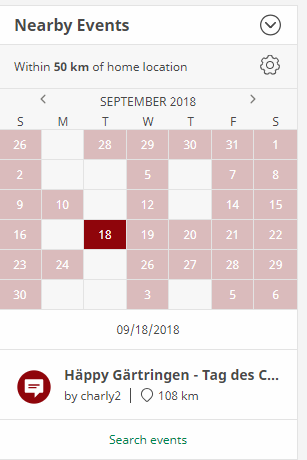
Hi, I just noticed that I could setup the search radius in the "Nearby Events widget". Great ! Too bad it doesn't seem to be working 1. I set the radius on 1km => I can see two events : 2 km and 6 km from home (!) + a mega event some 400km from home. All others are hidden 2. I change the radius to 5-10-20km => Same results 3. I change the radius to 50 km => I can see events up to more than 100km from home 4. I change the radius to 100 km => I can see events up to more than 250km from home ! 5. I select a 20km radius on a date I know an event in the radius that I attended. Then I click on that date, then "Search events". There should be one hit, but there's none, although all filters are set to "All". 6. I select a 100km radius on a date , then a date where there are 2 events below 100km, another 102 km far and, according the the link below, "5 more" to view. If I click on that link, I cannot see those 5 more events, but only the 2 that are inside the 100km radius. 7. I select a 100km radius => there are no events in January ! There are some if I choose 50km, none of which is actually inside the radius. That seems a little untested, doesn't it ? Thanks in advance for making it work correctly. Gillala
-
I have only one hand, how can I scroll now using only my mouse ?
-
Hi, this new version looks a lot better, thank you I just noticed a small regression. In the previous version of the MC, I could open up someone's profile by clicking on his/her avatar. It looks like it's now passé, pity EDIT : OK, I found it. I now have to click on the "..." button.
-
OK, at least I know. Thanks for the reply. I tried on my computer and it looked good. I still don't know how I will be notified of the PF. I hope I'll soon find out. I noticed that my archived logs (owner maintenance in the present case) still show up in the activities list. Is that on purpose ?
-
The new dashboard is just useless on my smartphone. All I can see are the menus. No content. When I scroll down the page, the background image takes like forever to load and that leads to strange artifacts. Pity, the new functionalities looked good on papier. I might give it another chance when it's working.

-
I prefer not to tell everything I'd like to, I'd be too long and a lot has already been written. And it could not be pleasant... So in short : - Great update, we now have several watchlistS to play with, thank you ! - In the "GEOCACHES" menu (do you have to shout so that we know GEOCACHES is a section title ? I conceed that it's not clear with the style used.), I really miss the link to show the nearest caches from my home that I haven't found yet. I used it a lot. How am I supposed to do now ? It takes me several clicks instead of 1 to reach the same result using a pocket query, and even more with the brilliant new search. Even looking for caches is made harder. Regression :S - Responsive design... look into it, really, it's not too late ! The old page wasn't really the prettiest, sure. Topping it should have been pretty easy. Well, as you had warned us, it's still a work in progress. And we, paying users, are the beta testers (am I the only one who's shocked by that ?)... And I'm just not confident, with the recent history of functions removal, (javascript) bug additions, bad design... Now everything's below the fold. Really unique. I fear the day the old pages will be removed.
-
Release Notes (Website: Help Center) - May 10, 2017
Gillala replied to Geocaching HQ's topic in Geocaching HQ communications
Fixed! We appreciate that you found this broken link, palmetto. Hmm, now it leads to a new page, but not to the right anchor... And when I click on the back button of my (chrome) browser, I stay on the GeoTour page unless I go back for a second time. This new help center looks good, really. But once again, who the hell tested it ? Don't you have automated tests that simulate clicks on all the links ? Ever heard of Coded UI (or similar) ? It can prove really helpful... BTW, the listbox "Select a language" is too narrow (in french at least), and its style is unique and doesn't look like anything else in the page. Still, this new design is very pleasant -
I haven't seen that, it might be a unique problem to your configuration. You should post your OS version and browser/version and perhaps somebody here could help. You haven't, other have, if I read it coorectly in the different threads concerning the new looging page. I don't expect any help, so it's not helpful to mention I used Windows 8.1 / Chrome latest version (see months old freeze with the map, which can only be prevented thanks to a script). It happens randomly. It's okay after a refresh. Appropriate testing would probably have shown that...
-
Once again, I wanted to post a note on one of my caches using the new page... But the log form remained all greyed out. There is a BUG in PRODUCTION !!! How can you just let it that happen ? And so long !!! Removing features is one thing. One bad thing. But adding bugs ! That is even less acceptable ! Come on guys, you're better that that !
-
Looks like more than a week later, obstination and silence have done their effect. People finally stopped complaining as it's just useless. Like all the previous (buggy) releases, this one will be imposed to us without further notice. Like it or not. Who cares ?
-
Well, you wrote it yourself, you don't play enough to see the negatives. Until you eventually encounter them... The mere fact you don't see problems does'nt mean there aren't, no ?
-
Thank you so much for listening to your customers' feedback ! The new page looks awesome now that the tooltip "Upload a photo" has been updated. It's almost perfect now. That was well a release note worth ! Now I just miss the page footer, like on any other page of the website, so that I can change the page's language or apply to a job...
-
In case you missed it (you seem to only answer to easy to solve issues, so I'm not sure), the change is mostly badly perceived. In this forum, we outlined a lot of (and not just a few) resons why. As for the blog post, I don't know what others do but I rarely read it. Well now I did. I have the feeling that the comments are not quite positive either, to say the least. I continue to give my feedback even though I am quite sure it will be ignored. Oh, wait, I found a tiny bug you can easily handle : the tooltip "file input" for the photo button is not very useful right now. Well, actually remove more fetures would be correct. As I already said, and others too in this thread : only as long as the issue is easy to handle. But when it doesn't go your way, you never give any feedback, sorry. Looks like ther's still a lot to be done here too (see bug reports) Responsive is something your new logging page is far from being, sorry. When all I see on my 22" monitor is white, then something is not responsive. When the loading circle doesn't stop looping on my phone, this is not responsive. When a mostly empty page takes 3 to 4 seconds - at best - to load, it's not responsive... What we want and need is not a website that is slower and offers less functionnalities. We could add favorites, it's not something new. Adding the possibility to add photos is good. It was already possible, but not from the logging page. Good idea. Bad implementation ! How come limiting everyone to be able to upload just one image ? If you need to free up storage, start up with old unused images... Professionnaly, I work with code written in the early 2000s. Guess what ? It's still working ! ( Like the code Groundspeak wrote back then, it's well designed and working pretty well. Must have been done by cachers who knew what other cachers wanted.) But as I need to maintan it and do some evolutions, I confess it sometimes is a pain. But there are changes to be made, which by the way will be done in more modern ways, using newer languages. Then there are people who design how the new things should look like. Others who validate the changes. Then I do the changes. Then someone checks my code, before the change can be properly tested. Then some people do the testing. Then I correct errors, if necessaty... and only once all the tests are OK, the change can be sent to production. With a small target group if necessary. There's a golden rule in the process : changes add something, but never remove anything that had been possible before ! Well, I'm pretty sure it's how you do too. We geocachers are (paying) users, no beta-tester, right ? As a customer, I can't believe how you treat us here ! As a customer, I should expect that the tools I've been using for years won't suddenly be worsened only because it was written a long time ago and your current developpers can's handle that ! Actually, how things are done doesn't interest me and is not my business. The only thing that interests me is the result. Removing functionnalities has nothing to do with old/new code. Increasing loading time has nothing to do with old new/code. Javascipt code that has your pages (map freze, message center freeze, now log page freeze) has nothing to do with old code It has with new code... And I won't even complain (oops, I am) about all that being done because of one of the poorest geocaching applications from the market that I've tested so far. Look at your concurrents/partners (?), it could be instructive. As of now, your release is not thoroughly tested and is not ready for production use. Why not confessing it, do the job, communicate about it and go live back later when it's eventually ready ? You proved with the withdraw of the "challenges" that you could admit when something didn't work out as it should. It's about time you recognise your mistake, isn't it ?
-
Neither do I. I want it to remain the same because it's better ! Change is always welcome when it brings improvements. The new page looks good, and that's about it. From all other perspectives, it brings less to the table. Maybe the developpers should look into responsive design media queries... It is actually possible (and not so hard) to improve the look and feel for apps / smartphones / tablets... without impacting desktop users. One day, maybe...
-
Good idea, too bad it doesnt work...
-
If I believe what I'm reading here and there (and what I also think), this release is by no means an improvement. Nobody semms to think ant good of it. Please review, rethink, redo, re-what-you-want, but do not release this alpha version of the logging page ! Please ! You have the staging site for that purpose, haven't you ? If you were, you wouldn't mess with the current logging page. Once the new page is ready and once it is really an improvement, we'll sure all be glad to use it. But not quite yet ! We - geocachers are the ones who use the logging page on a daily basis. You - Geocaching.com - are the ones who make it possible. Why making our task harder instead of helping us. We need each other. So why don't you listen to us ? Please someone tell me, because I honnestly can't think of any good reason right now.

.png)
.png)

